I already was a fan of Walter Benedict in The Hague, but couldn’t remember my last visit exactly. Last week I rediscovered Walter. The menu is still filled with not too complicated classics. The coffee is good. Love the burger. Nice wine-list. Staff still wears their smiles. My new Walter crush evolves all around their interior-choices.
Concepts in hospitality
Scrolling though Pinterest // search > coffee bars, cafe’s, interior < // my timeline fills with shots of vintage interiors with dark greys & greens. Wood, black window frames, chalk boards, rough brick walls and plants. Apparently we all like those kind of interiors! The thing is; they all look the same. At least many do.
I must admit I’m a fan of those simple styled easy going interiors too. But sometimes I miss the point. Let’s put a cactus on the table; hip & happening? I wonder: Is interior design done on the side of creating a serious hospitality business? Is the metier of interior design underestimated maybe? Or do concept creators in hospitality lack of inspiration?
Interior design is not about following the trends, creating instant hipness or copying an Instagram timeline. Interior design is a reflection of a brand. This might sound conceptual, but what it actually means is, it shows the soul of the people who create and make a place. If you can feel that as a customer, it makes you want to come back! It’s not about the Pantone colours, it’s about the vibe….
Soul and sound in the interior
Getting that vibe takes a design process with space for authenticity and some surprises, instead of copying an existing success formula or style-book. Any creation process takes time, effort and love. And maybe some mirroring. Whether there’s a budget or not, there are always some customers to talk to. Are you really designing for an average crowd? ‘Average’ is not easy to connect to…
Walter’s choices
So, I noticed the owners of Walter Benedict made some choices and changes. And probably listened to the feedback of their customers.
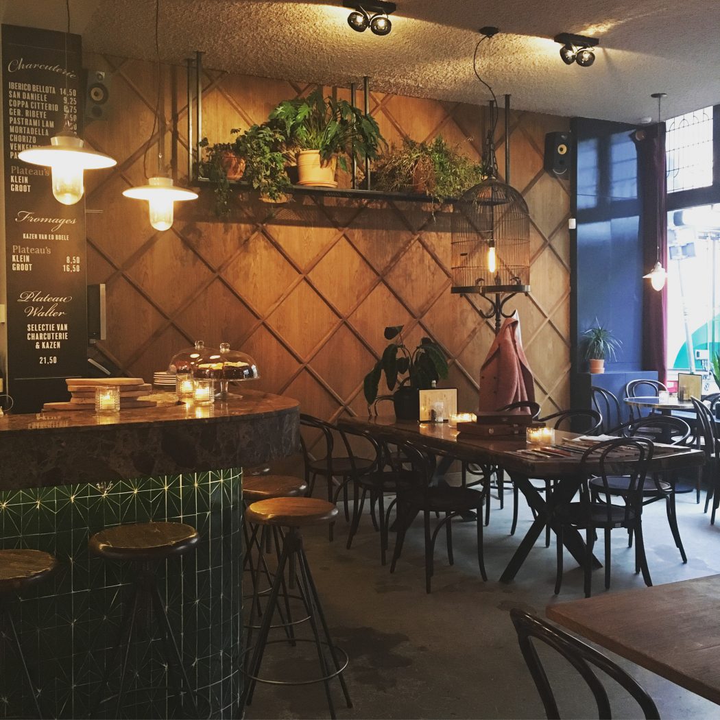
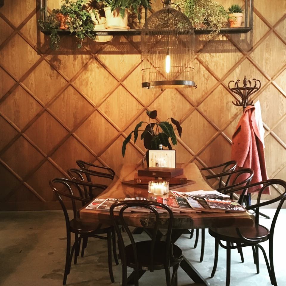
The rough brick wall is replaced by a nice wooden panel and a cool frame with greens hanging down from the ceiling. I love this solution because it’s not standard, it looks beautiful, stylish and it seems effective in solving the acoustic issues (also partly solved by the foam against the ceiling).
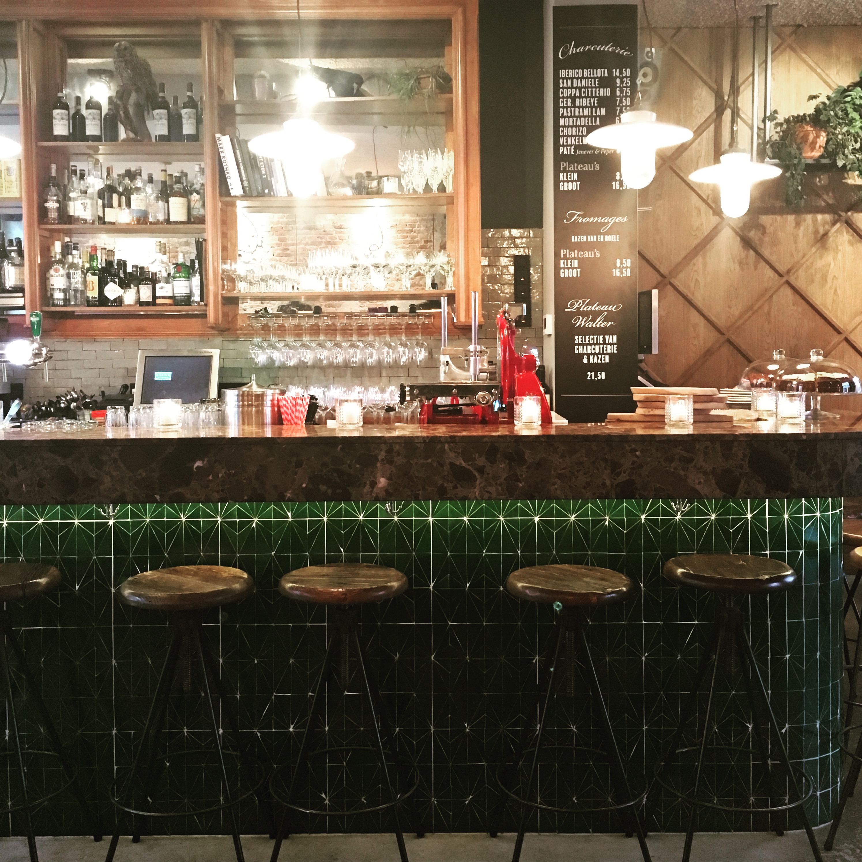
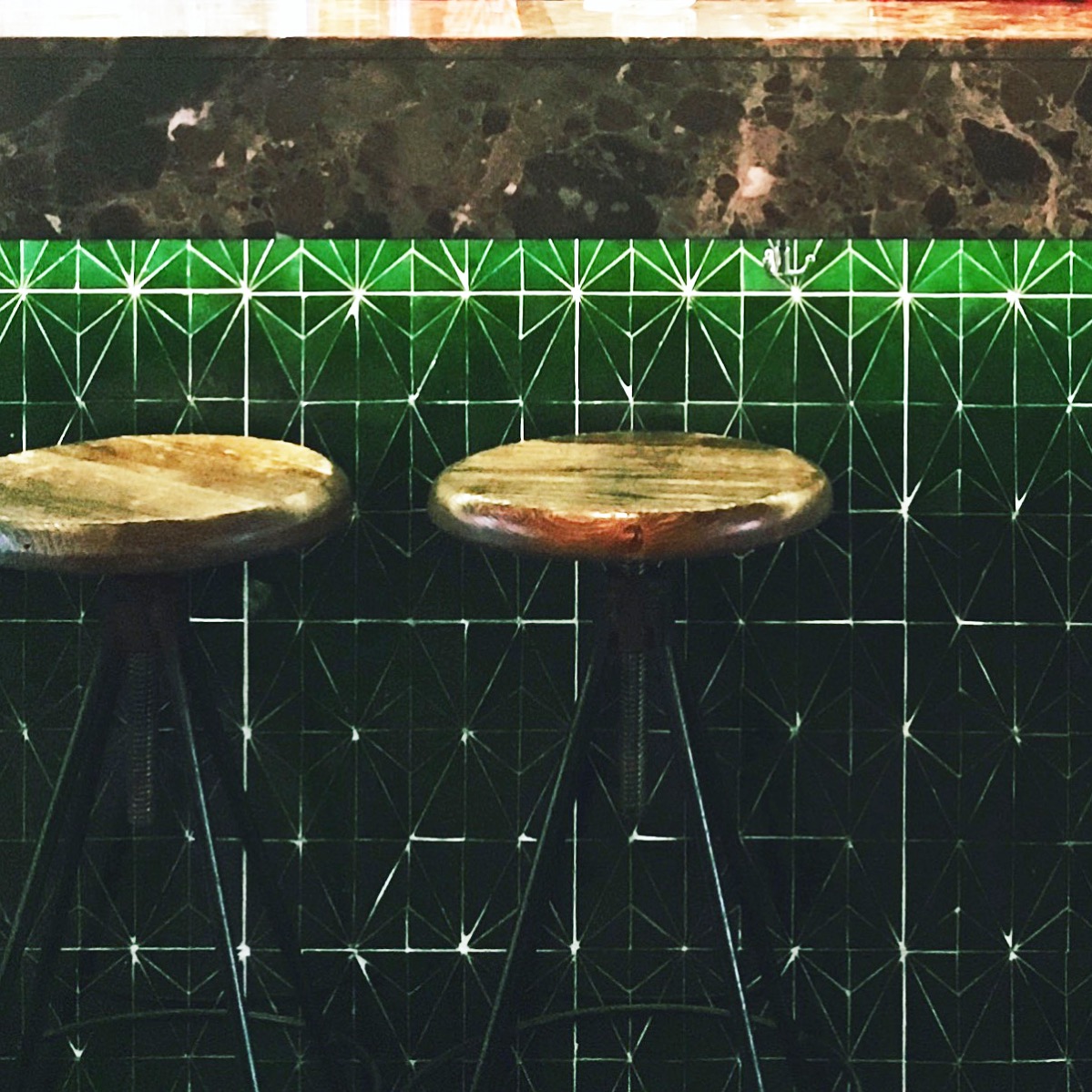
The new bar is made of brown marble combined with dark green Moroccan tiles. I love it! Not a standard combination and not the type of tiles you buy in big stacks. Very sexy bar.
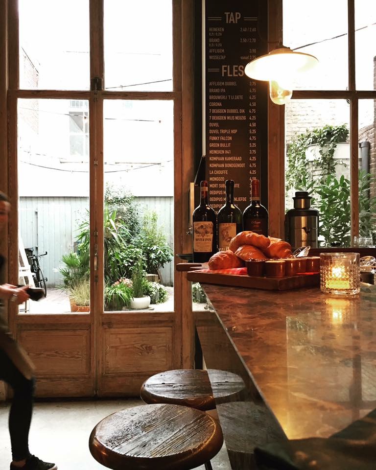
More warmth is created by using darker colours on the walls. A dark grey that’s authentic and not boring because of the combination with the plain window frames.
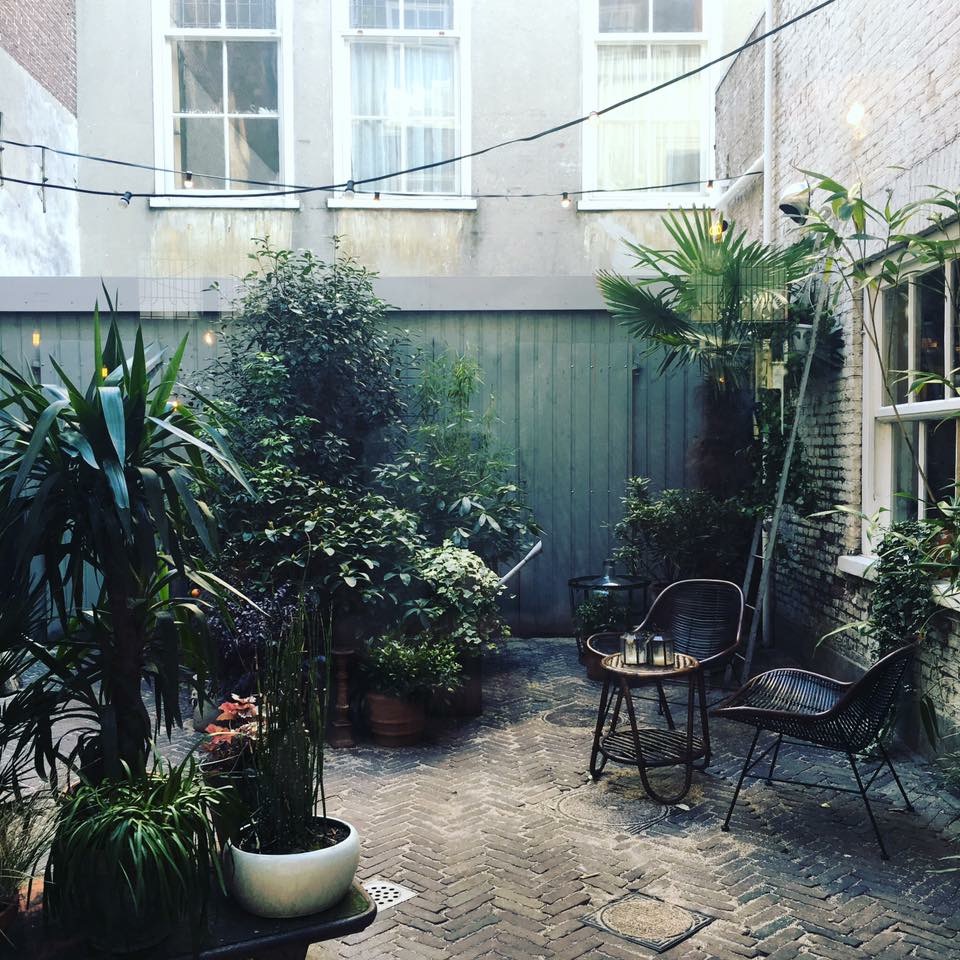
Compliments Walter Benedict! Love the new interior elements (and some of the old, like the garden), but foremost; I love the fact that you made some choices and became a grown-up confident cafe-bistro. You can’t be missed on the The Hague Denneweg!
More // Walter Benedict
Tekst & Pictures // Rosan Gompers
The Style Office is a storytelling magazine on urban work- & lifestyle aimed at the next generation creatives & entrepreneurs. We love to share ideas and stories on new ways of working and creative entrepreneurship AND we love to inspire you on a great work- and lifestyle // hashtag #designyourlife // read more about us and learn what we can do for you. We’d love to meet you!

